My image processing workflow
In this post, I want to explain how I process my photos via Adobe Lightroom 5 and Adobe Photoshop CS 5.5.
First of all, I want to underline that image processing can’t help when the raw material is bad. Hence, I always try to get the best possible photo directly on location. Therefore, the use of filters like polarizer, neutral density, and graduated neutral density filters is an inherent part of my photography just as my tripod, which I used for every photo you can find on my homepage. Besides these accessories, also the correct exposure is essential for a good photo, wherefore I always monitor the histogram of a picture and try to avoid clipping of of lights or darks in my images. Those technical prerequisites, together with the right location, the right light, and a good composition are absolutely necessary for a good image! Without them, you don’t even need to begin the image processing…
Nevertheless, the processing of an image is a necessary part of digital photography, just like the chemical processing of analog films, and permits a wide range of possibilities to influence the mood or the character of an image. Since the launch of my photography website, I developed a certain way of processing my images, which is nearly identical for most of my pictures. Of course, fine adjustments have to be made to adapt it to the particular picture, but the major steps and settings are always equal. In this post, I want to show you my way of image processing, which needs about 10-30 Minutes depending on the picture. Certainly, it is neither the best way nor a recommendation on how to process your images, it is just meant as a kind of documentation which will hopefully be of interest! :-)
0. RAW Image without any processing
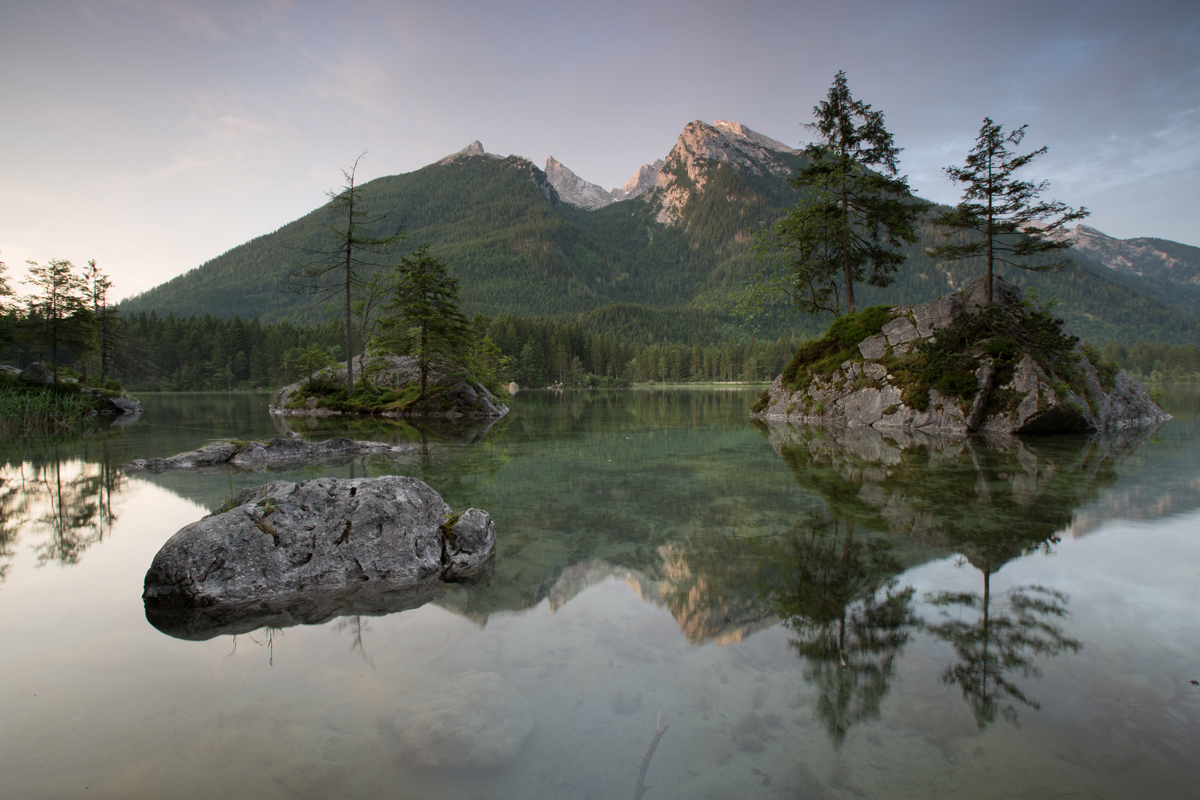
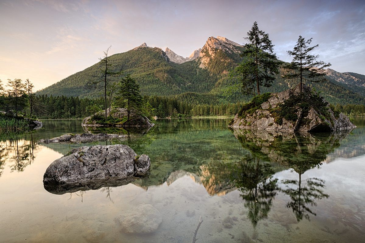
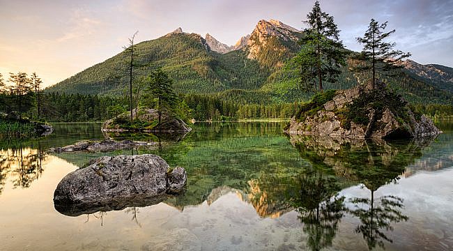
To illustrate my workflow, I show you the steps on an image I recently took in the morning at the Hintersee near Berchtesgaden (Bavaria). As you can see, the RAW image is quite flat and lifeless, as there is no internal processing in the camera like it is done in JPEG images when shooting in RAW. Every processing has to be done afterwards and you have the full control on it!
1. Pre processing in Adobe Lightroom
My image processing workflow consists of two major parts: As I shoot in the RAW format, I first have to do a pre processing in Adobe Lightroom.
I first set the correct white balance and select the Camera Profile that suits best to the image according to my opinion. Very often, I choose the profile “Camera Landscape” (with a reduction of the blue saturation by about -40). After that, I mostly do the same basic modifications (slightly modified depending on the picture):
- Highlights -40
- Shadows +40
- Whites +10
- Blacks -10
- Clarity +10
- Vibrance +10
- Point Curve: Medium Contrast
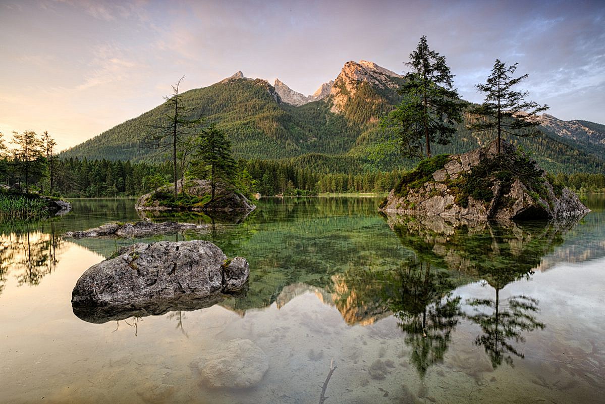
Again, it is necessary to check the histogram of the image to ensure that no light or darks areas of the image clip as this causes a loss of details! The next image shows the result of my pre processing in Adobe Lightroom, which is already more colorful and interesting than this unprocessed RAW file.
After this short work in Adobe Lightroom, I export this image to Adobe Photoshop as a PSD file to do the post processing.
2. Blending of two exposures (with and without polarizer) in Adobe Photoshop
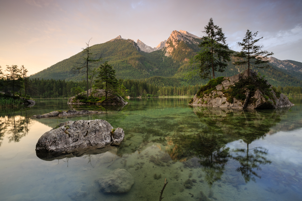
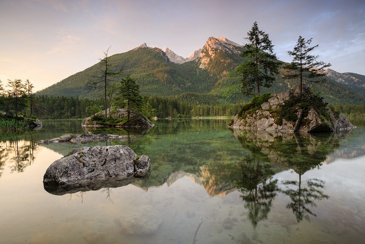
As a pecularity, I blended two exposures of this image. Many photographers do this blending to cope with the dynamic range of an image, but this was no problem in this case as I used graduated neutral density filters to reduce the brightness of the sky so that no areas of my histogram clip. Instead of that, I wanted to combine two exposures with different settings of my polarizer, which I used to enhance the reflection of the mountain in the water. However, this setting of the polarizer also reduced the warm light on the mountain, wherefore I made a second exposure where the polarizer was set to reduce as much reflection as possible. You can see the differences resulting from the polarizer in the next two images:
Maybe this is only a minor correction, but I wanted the warm colors on the trees upon the mountain of the version with reduced reflection in my final image, together with the enhanced reflection in the lake, and so I had to blend these to exposures via a hand-painted mask in Adobe Photoshop.
Such exposure blending is not part of my normal workflow, because I try to get the most out of one single frame without doing too much retouching. However, in some situations this technique is really helpful, wherefore I included it into this post. After this blending, I start working on contrasts and colors of the image. Usually, I firstly apply some filters from the NIK Collection which contains some very interesting filters that are very easy to use and definitely worth the money in my opinion!
3. Contrast enhancement with NIK Color Efex filters
I normally start with some contrast work in Color Efex, wherefore a generated a set of filters with some standard settings that I mostly apply without any changes:
- Bleach Bypass with Brightness 0%, Saturation 0%, Contrast 20%, and Local Contrast 5%
- Detail Extractor with Detail Extractor 5%, Contrast 0%, and Saturation 0%
- Tonal Contrast with Highlights 5%, Midtones 5%, Shadows 5%, and Saturation 0%
As I only want to modify the contrast of the image, I set the layer mode to luminosity, because those contrast enhancements often result in reduced colors.
As you can see, the resulting image has much more contrast than the previous version. It might be too much for someone, but honestly I like this popping and contrasty style… :-) Sometimes, it is necessary to reduce the effects of the filters, which can be done for the whole image by reducing the opacity of the layer, or for certain parts of the image, by creating a mask.
4. Saturation and structure enhancement with NIK Viveza
This step is also not part of my normal workflow, but in this case, I thought that a little bit more color would be helpful to underline the warmth of the sunrise. So I used the NIK Viveza plugin with the following settings:
- Brightness 0%
- Contrast 0%
- Saturation 30%
- Structure 30%
You can see the change of the colors, especially in the yellows and greens in the next comparison:
5. Tonal balancing with luminosity masks
Luminosity masks are an extremely powerful tool as they allow to select only bright or dark areas of your picture (in various gradations like darks, shadow darks etc.). As I am far from being a specialist in luminosity masks, I won’t give you any more explanation on that, but I highly recommend the Tutorial of Tony Kiuper if you want to go deeper into this subject! He also offers a panel with predefined actions for Adobe Photoshop which might facilitate the work, but until now, I only use my own set of actions to create the masks.
Mostly, I apply adjustment layers to the following luminosity masks:
- Lights: a slightly S-shaped curve to enhance the overall contrast between light and dark
- Bright Lights: I pull the curves downwards (like a “U”) to bring back the bright areas within the sky
- Darks: again a slightly S-shaped curve; sometimes, I also use this adjustment layer to brighten the image a little bit
- Shadow Darks: a levels adjustment layer where I reduce the white point, roughly about 200
- Basic Mid Tones: a stronger S-shaped curve to enhance contrast and color of the image
Of course, this is only a very general description. Each adjustment layer and the intensity of adjustment has to be adapted to the specific image. Sometimes, it is also necessary to reduce the opacity of certain layers or to set the layer mode to luminosity or color if you only want that contrast or colors, respectively, are affected by your adjustment. Just try it out and find your own way!
Here, the effects of the tonal balancing with luminosity masks are rather subtle, but still visible and support the contrast between dark and bright areas in the picture.
6. Dodge and Burn
This is a technique that I discovered recently and found it quite helpful in some occasions. It allows to lighten or darken certain areas of a picture manually in order to underline certain structures. You simply have to create a new layer filled with 50% gray and set the layer mode to overlay. Then, choose a brush with opacity of 5-10% and set the hardness of the brush to 0%. If you now paint with black (white) color on this layer, the concerned areas get darker (brighter) without altering the colors or underlying structures. Hence, you are able to accentuate certain details in your picture, like I did with the shadows on the left flank of the mountain or the leaves of trees on the rocks for example.
7. Final processing (sharpening, cleaning, vignette, denoising)
When I’m satisfied with the look of the image, I start the final processing of the image.
At first, I sharpen the image via two layers of high pass filters with a radius of 1 pixel for fine details and a radius of 3 pixel for rough details, where I set the layer mode to Overlay and Softlight, respectively. Again, it is possible to reduce the sharpening effect by reducing the opacity of the layers.
Sometimes, I also add a vignette to the image in order to emphasize the center of the image. Therefore, I mostly use the Darken / Lighten Center filter from NIK Color Efex
After that, I do a little cleaning of the image and remove distracting elements or sensor dust, like I did with the stick in the foregrund of the image.
The last step is the denoising of the image, if necessary, wherefore I use the NIK Define tool and paint a mask to have better control on the denoising, because I don’t want to loose to much details in areas where noise isn’t problem like on the mountain. In contrast, I removed noise in the sky or in the watermore intensely, because it is more visible.
8. Export for the web
Before uploading the final picture to the internet, I add my logo to the photo. Then, I use the free Web Sharpener Tool by Andreas Resch to reduce the size of the image depending on the purpose (Homepage, Facebook, 500px, etc.).
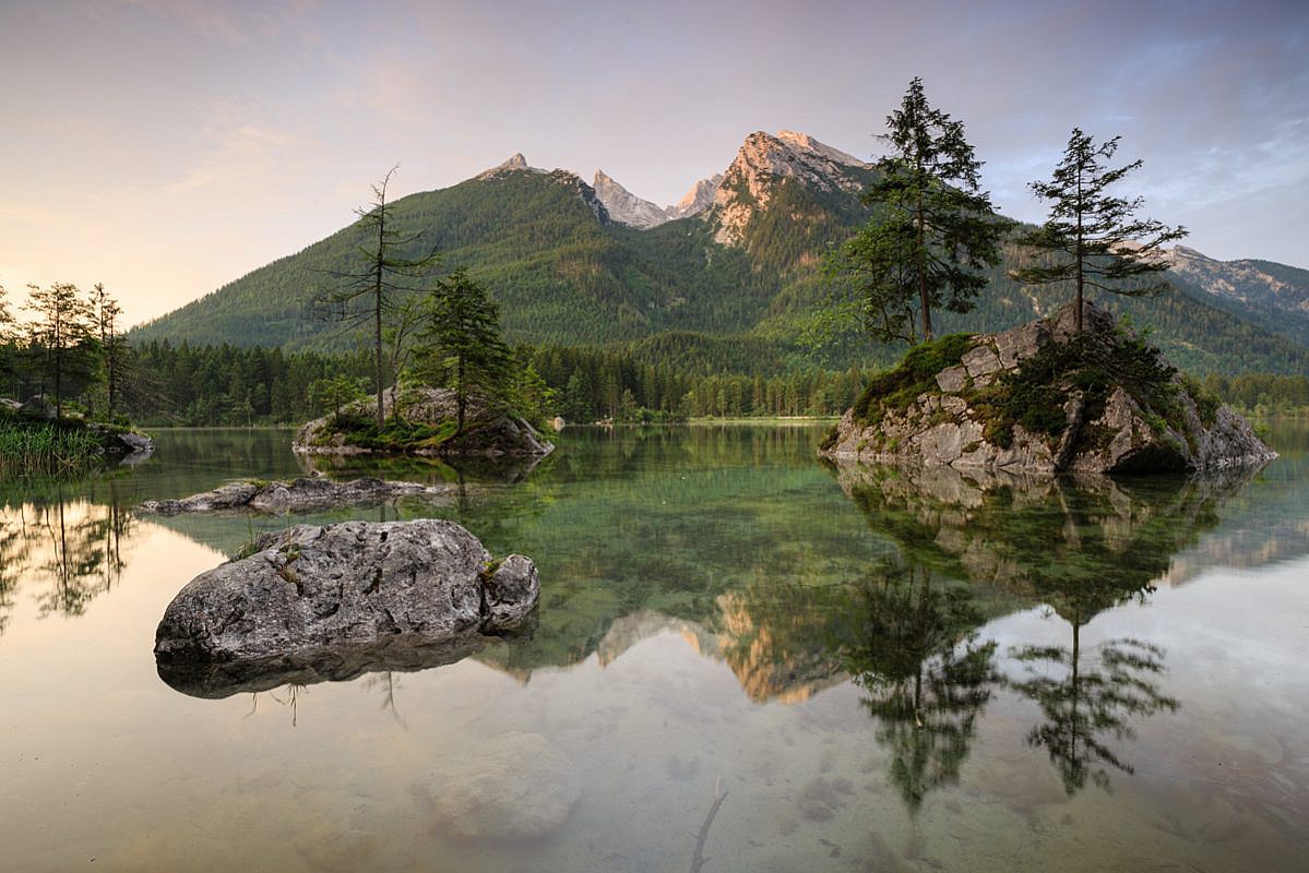
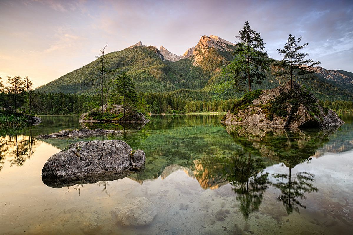
In the end, here are two comparisons, first the final image (step 8) compared to the unprocessed RAW file (step 0) and second, the final image versus the pre-processed version resulting from Adobe Lightroom (step 1). Thereby, you are able to see to the effects of the whole image processing from the unprocessed RAW file to the final file as well as the extra benefit of the steps in Adobe Photoshop compared to the exclusive use of Adobe Lightroom.
Unprocessed RAW image vs. Final image
Preprocessed image from Adobe Lightroom vs. Final image
This was my image processing workflow which I apply to almost every image I show on my homepage or in other communites in the web – with the exception of step 2 (exposure blending) and step 4 (NIK Viveza) that were somehow special for this image and do not belong to my normal work. I hope that this little insight in my image processing was interesting for you! If yes or in the case that you have any questions, I would be happy if you leave me a comment. Of course, I am also interested in your recommendations on my workflow as I am still learning to use Photoshop and I am far from being an expert… :-)
Gerhard
